
Chicago Cubs
The Chicago Cubs are a legendary baseball franchise based in Chicago, Illinois. Founded in 1870, they are a part of Major League Baseball (MLB). The Cubs play their home games in one of the oldest baseball stadiums. They have a storied history and have won multiple World Series titles.
The Cubs have been using their current logo since 1979, making it one of the most popular. I embarked on this endeavor to give it a "youthful" update, but also because I felt it was a shame not to use the bear cub as the main logo.
During the design process, I attempted something innovative. I drew inspiration from the iconic facade of Wrigley Field, as well as the distinctive shape of the field when viewed from above: the pitcher's mound and the infield within the bases.
The concept is therefore composed of elements unique to this sport and team. It's also a way to blend the historical aspect with a touch of modernity in the branding. Supporters will thus carry a part of Wrigley Field with them at all times.
Current logo

Inspirations

Research

Colors


Current vs Concept

Details

Primary logo with wordmark


Primary logo
Here is the version that will be most used across the club's various merchandise and communication channels. Its simplicity offers a wide range of possibilities. These elements, in my opinion, make it an iconic logo.


Secondary logo
The Cubs have such a rich and profound identity history that I spent a long time considering other options for this redesign. Ultimately, I chose to retain the iconic 1957 "C" version out of respect for the team's heritage and tradition, while also acknowledging the emotional attachment fans have to this symbol. By preserving this version, we not only honor the Cubs' glorious past but also celebrate their ongoing influence in the current sports landscape.


Third logo
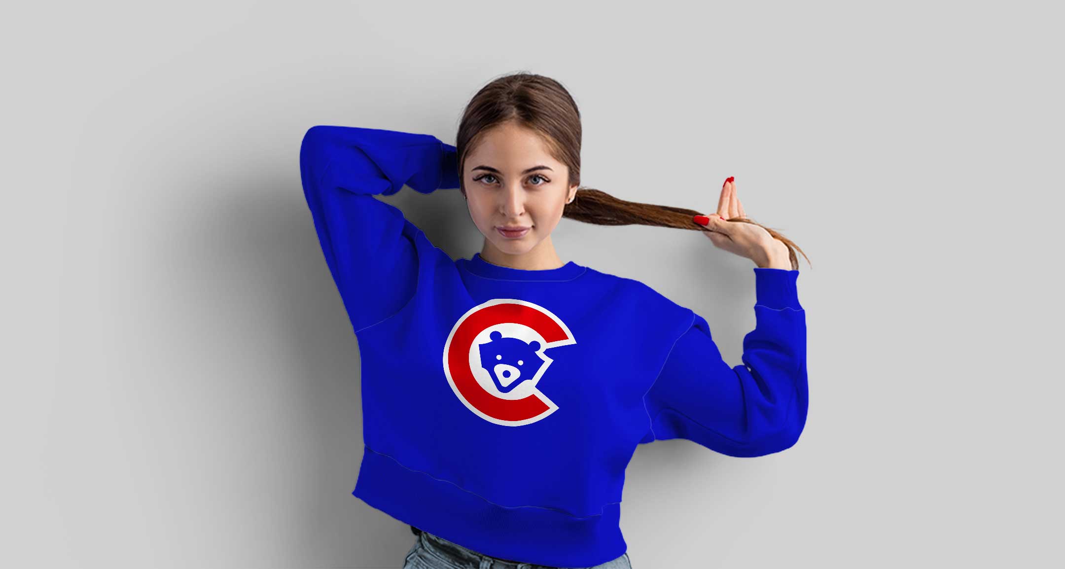
This version draws inspiration from a popular club logo since 1979. By modernizing this symbol with the contemporary design of the new cub, the goal is to combine the team's heritage with a current aesthetic, offering fans a refreshed interpretation while preserving the historical essence of the emblem.


Fourth logo
Originally, the word "Cubs" was in red on a white background with a blue outline. To reinvent the design, I transformed this outline into an additional "C" shape, subtly overlapping the franchise's initials to create a new concept.


Uniforms

Home
The Cubs play in white on their home turf, with white uniforms featuring blue stripes on both the jersey and pants. The cap and socks are blue.

Away
The blue uniform is used for the team's away games. This color is among the most famous in the sport, notably because they are the only team to use this color scheme.

Alternate
The alternate uniform adds a neutral color to offer an additional palette. The rest of the outfit features red and blue details that recall the franchise's colors.
In context


Merchandising


NOTE: I am not in any way affiliated with any brand, the concept design included in this project is for artistic purposes only. All trademarked material are property of their respective owners.